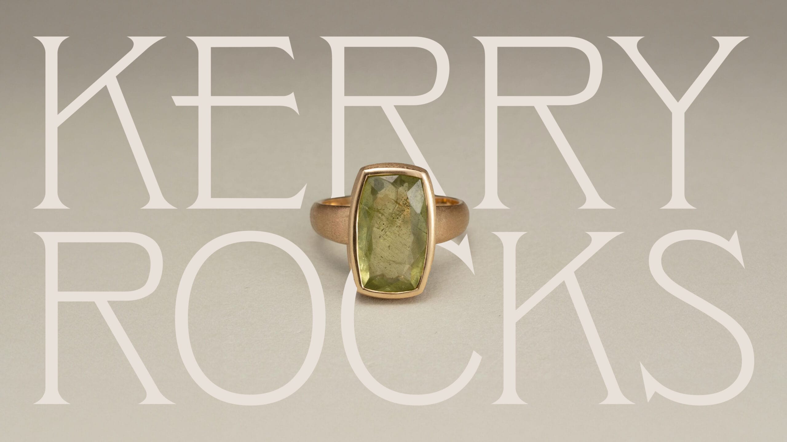
Kerry Rocks
Raw elegance blending contemporary sophistication.
Australian Jewellery Brand.
Project Scope
- Brand Audit
- Brand Identity
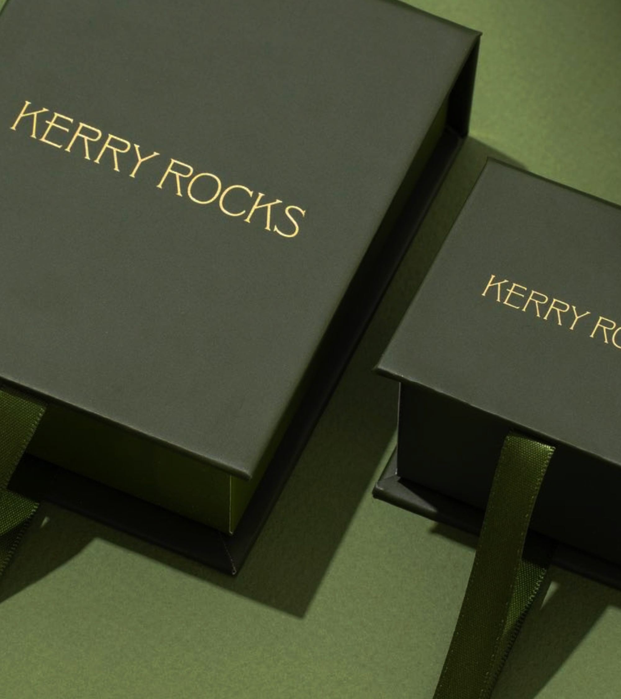
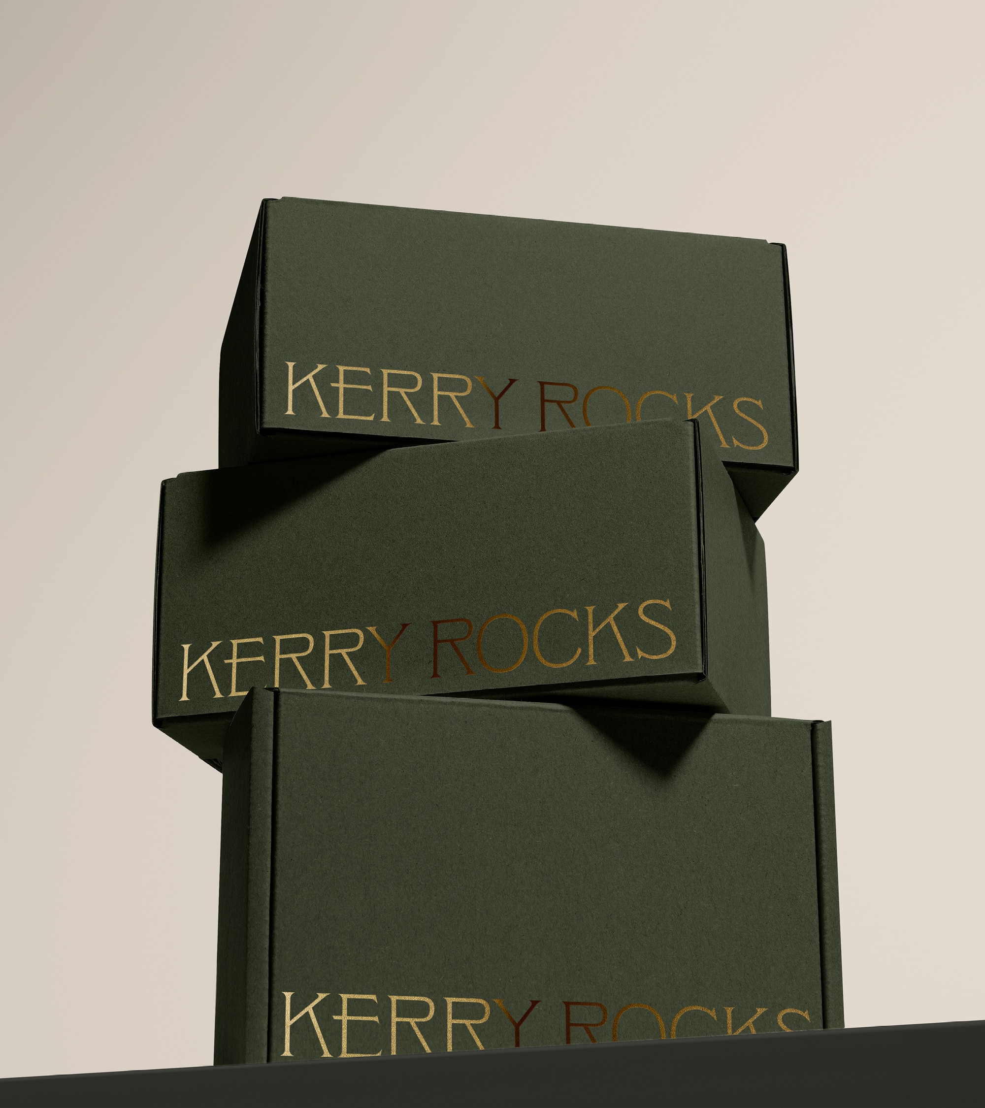
- Packaging Design
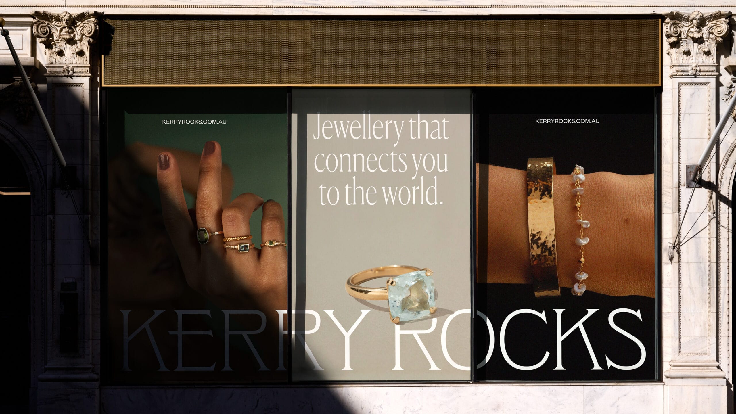
- Art Direction
- Copywriting
- Social Media
The Opportunity –
A contemporary Australian jeweller focused on creating wearable moments, Kerry Rocks has carved itself a unique niche in the market. Backed by a rich history and brand story that failed to translate in existing branding or connect with their core values, this project embarked on a complete brand repositioning with an aim to elevate Kerry Rocks with the current market.
Our Approach –
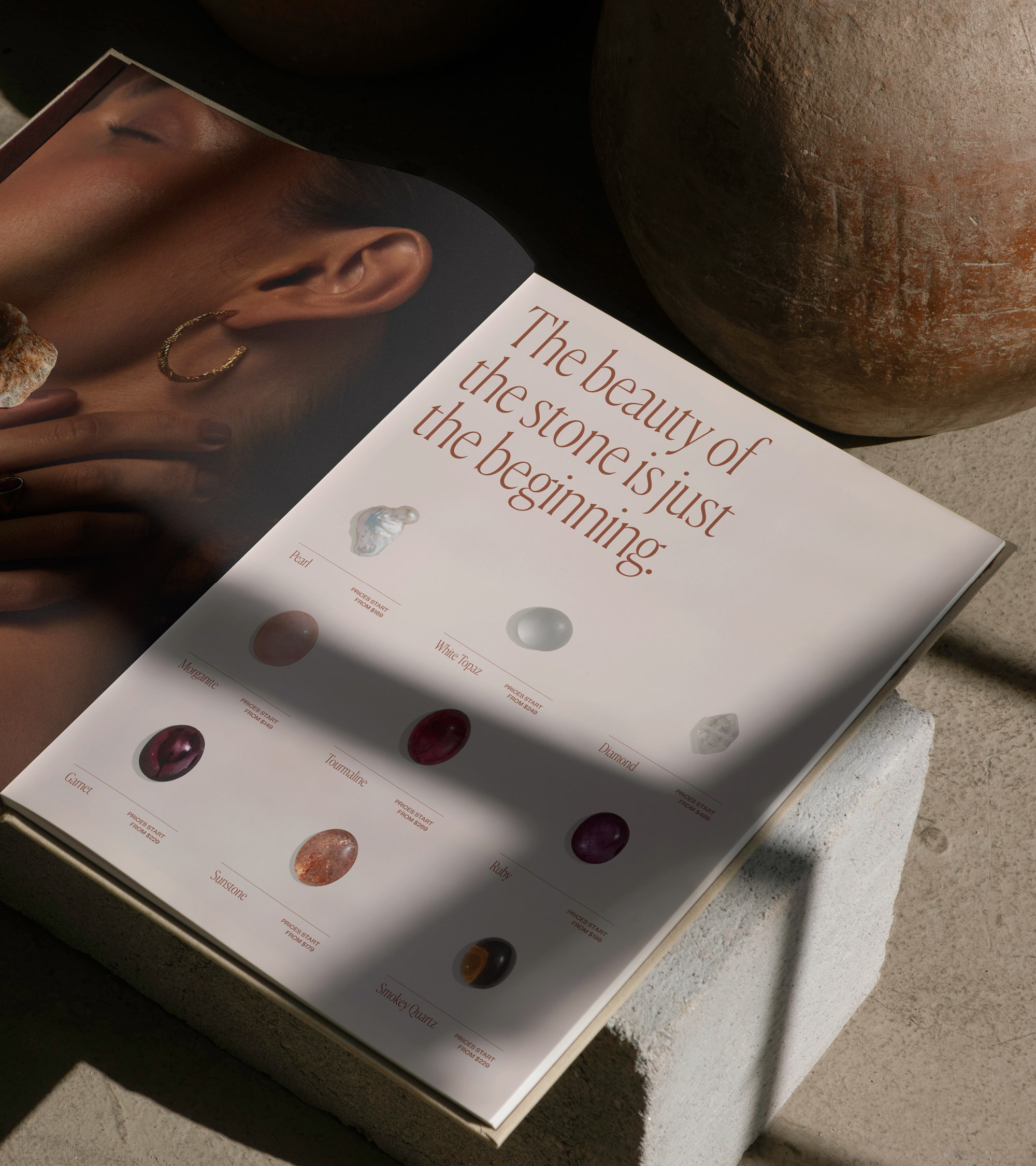
We set out to decipher a clear and recognisable brand identity for Kerry Rocks — an identity that leverages the brand, and founder’s, story. We built a concept on the unique rarity of the gemstones used, and the rich history each stone holds — highlighting beauty beyond the stone. This authentic storytelling approach would ensure we establish trust and connection with consumers, and ultimately attract a broader audience to the brand.
“SM House did a brilliant job building our brand identity. They delivered above and beyond – understanding our vision and bringing it to life with a high level of strategy and sophistication.”
Design Notes –
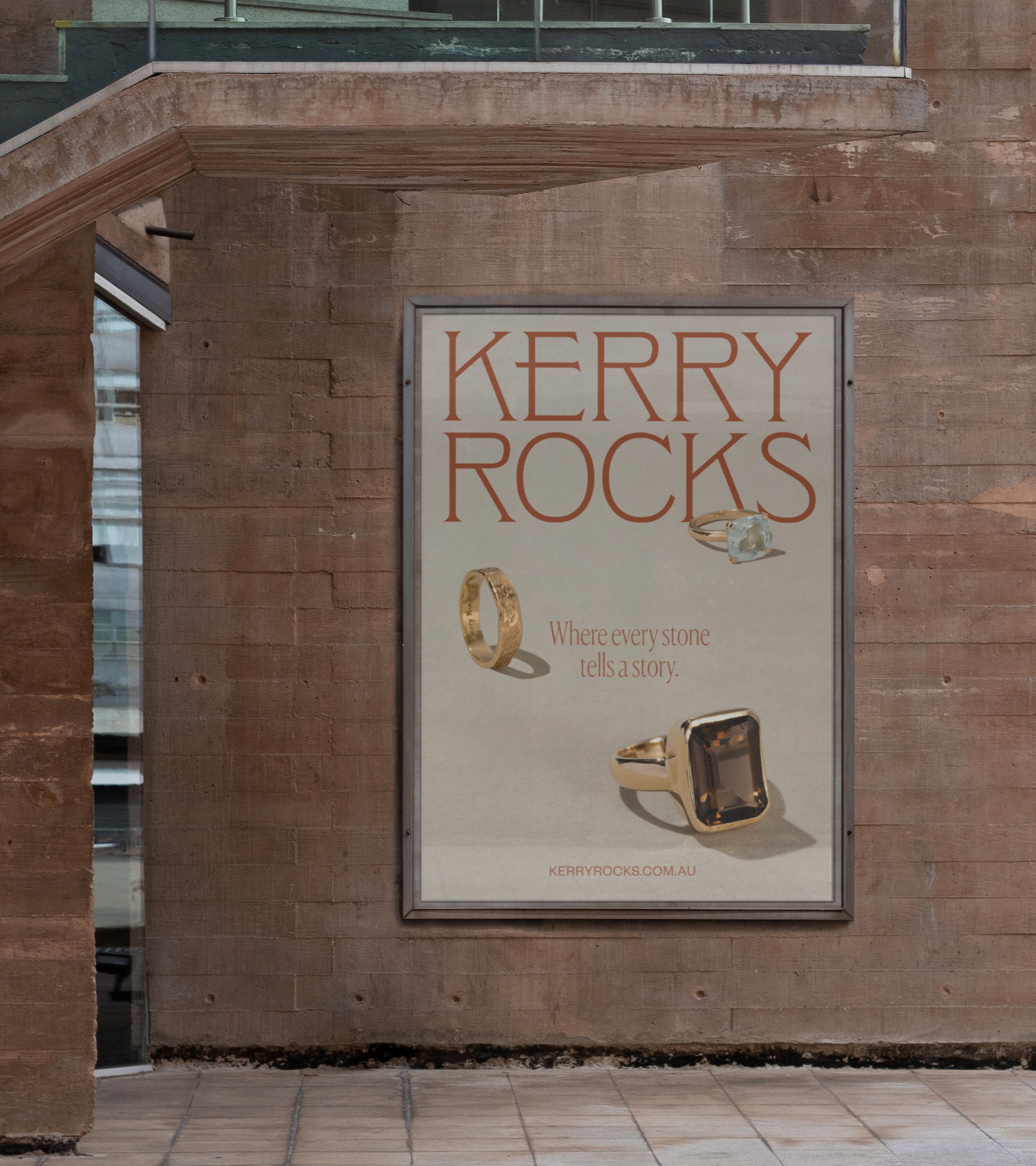
Highly aware of competitors in this space, we consciously strove to adapt a different direction to the design. The story of stones concept, driving our design decisions at every touchpoint we set to craft visuals focusing on raw elegance.
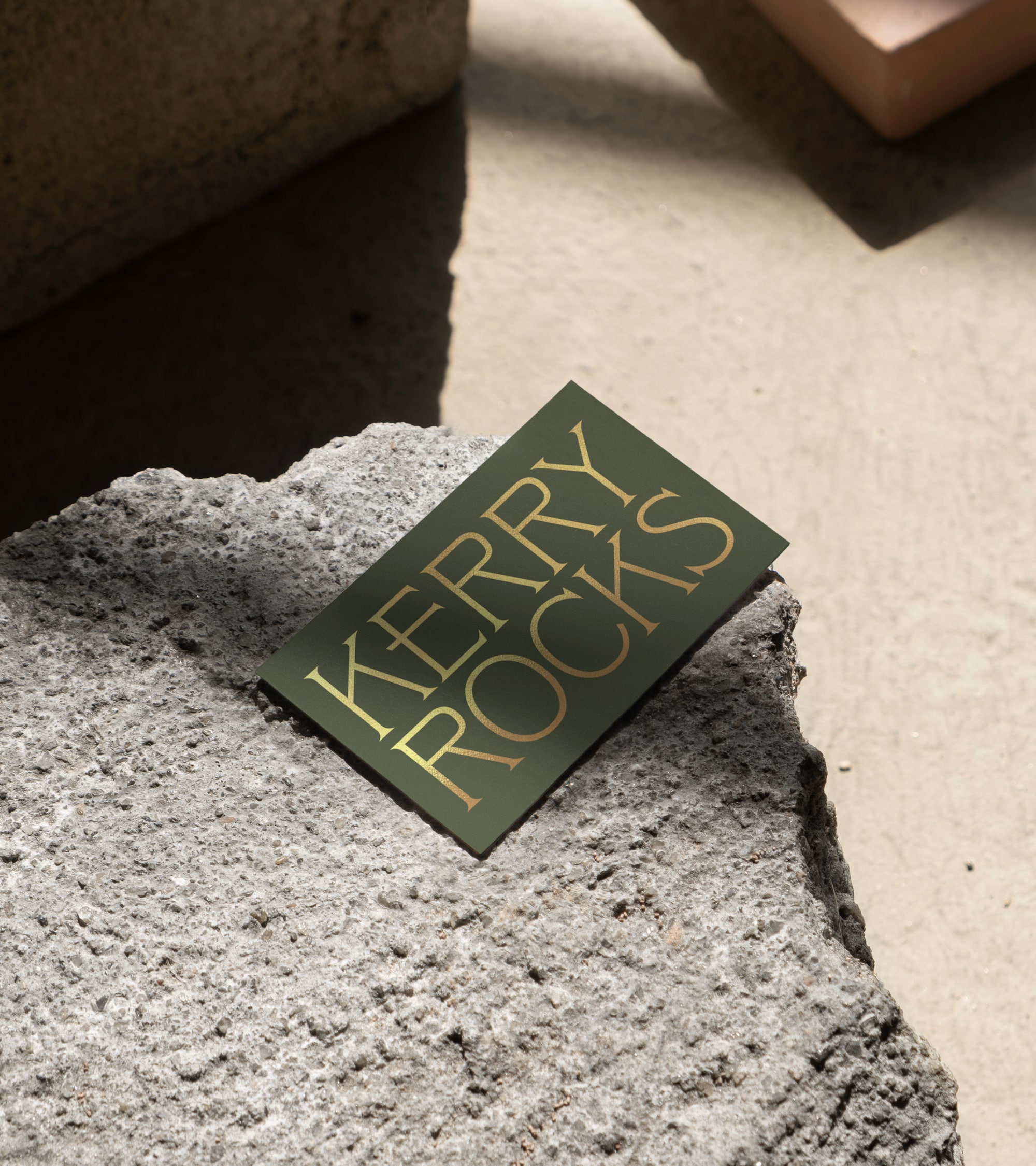
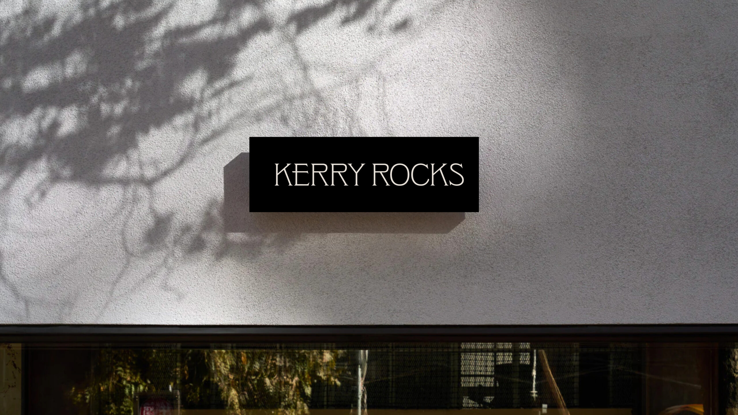
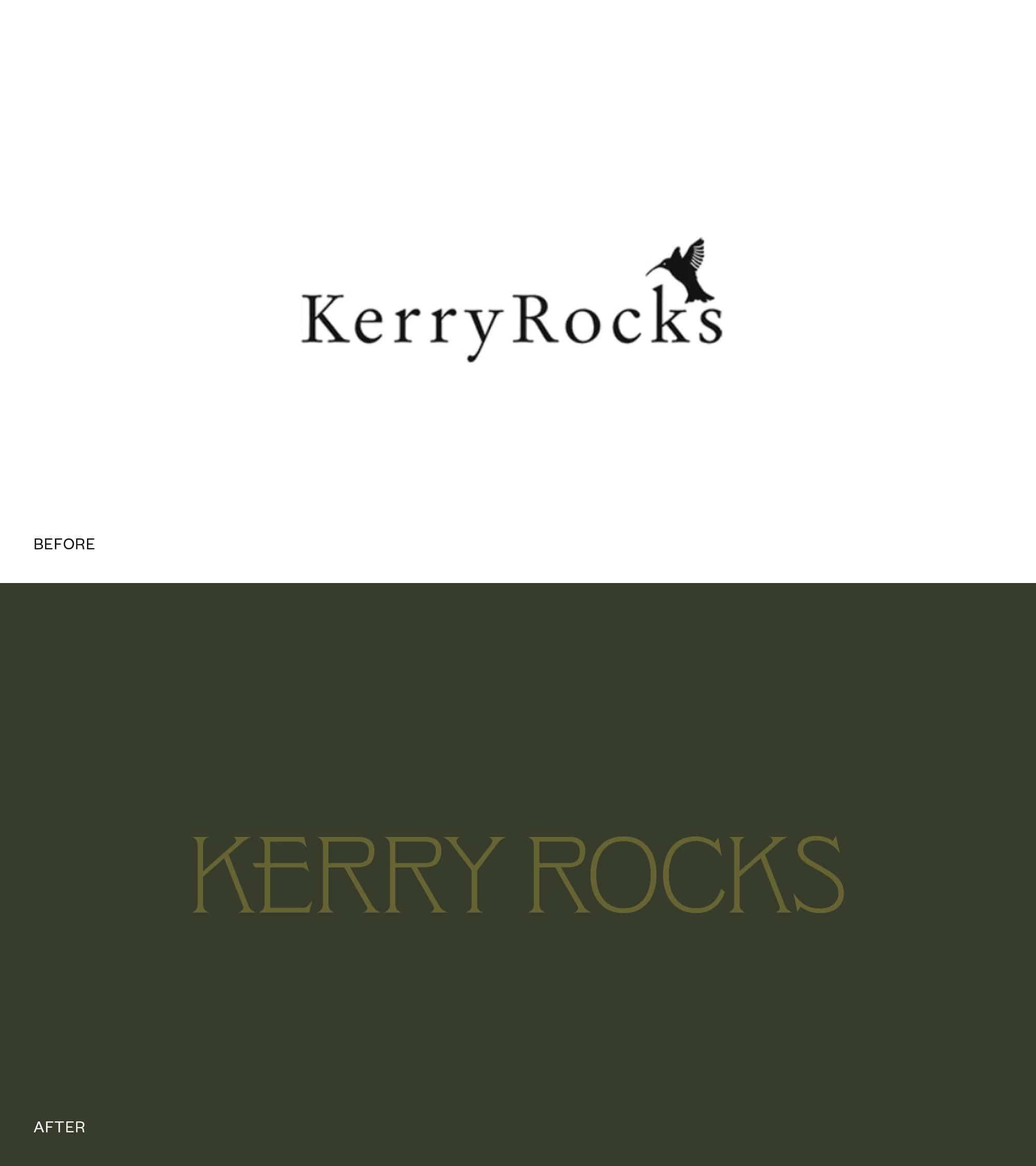
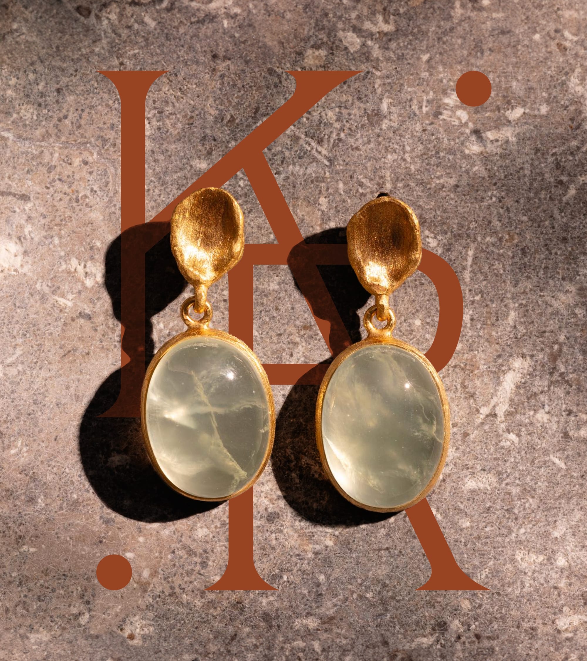
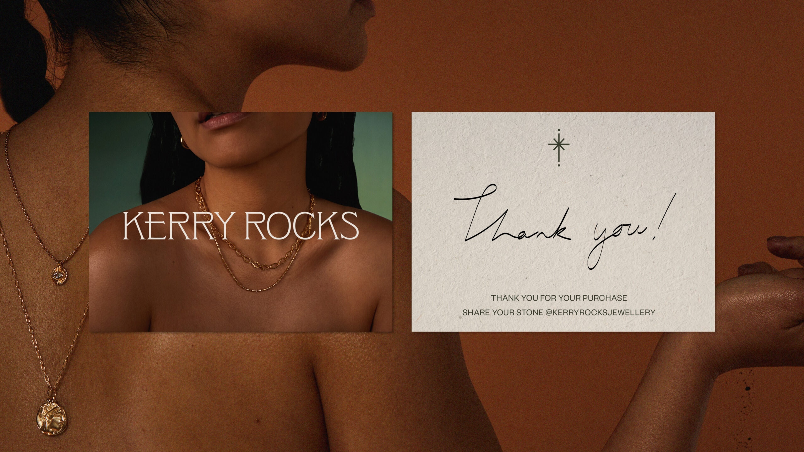
The logo marque boasts an edgy sophistication. Letterforms have been customised to highlight the raw beauty and imperfections in each stone. Structurally, the word marque has been designed to mimic a cut from stone effect.
A brand marque was created to feel like it has continuous energy radiating through each letterform, amplifying the stone’s every vibration — emulating fluidity, symbolic of the connection between the brand and consumer. Complimentary dots were paired with the marque to represent the connection to people and places associated with the brand. We established a supporting colour palette inspired by the deep, richness of the earth linked the branding to the product while creating depth and meaning.
“The new branding has had a hugely positive impact on our sales and customer feedback.”
Kerry Beard – Gemologist and Founder